Stay Above the Median
Posted August 6th, 2010 at 4:43 am by Matt
I’m planning on buying a house with my wife in the (near?) future and we’re in the learning phase of mortgages, financing, PMI, debt-to-income ratios, points, taxes, blah blah blah. It sounds exhausting doesn’t it?
Through the process I’ve thought to myself, maybe we should wait and put 20% down. Then we can get a fixer-upper1, save on things like private mortgage insurance2, and probably get better rates from a wider variety of lenders.
That’s a lot of coin, though. No matter how you dice it.
Figure for a $200,000 home you’re looking at about forty-grand. Median home prices were about $215,000 in 20093 so this really doesn’t seem like a crazy amount. Now, I suppose you could look for something more affordable, but where I am (in Connecticut) if you’re after a single family home you’re still probably in the $150,000 range – which puts your 20% down-payment at $30,000. This whole 20% really has my attention now and it’s leading to a few questions and lot of frustration.
I don’t recall hearing about my parents or in-laws living with their parents for an extra gajillion4 years to save the 20%. I’m sure in their generation did, which is cool, but now I’m convinced there has got to be more to this. Why does 20% seem like so much, or could it just be me?
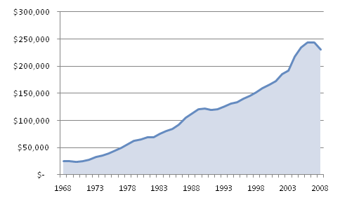
I thought it’d be smart to start by looking at the numbers. Specifically, I kicked off my investigation by looking at median home values (nationally) over time.
Figure 1
I think there’s a growing trend here 5
My thinking went something like this: Perhaps because homes were much cheaper…they also were more affordable. Nay you say? Alright, I give, you’re right – they’d only be more affordable if annual salaries were higher versus home prices than they are now. So let’s look at that next.
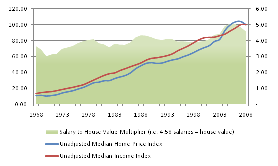
Figure 2
Hmm…not quite as obvious what’s happening here 5/6/7
This graph is showing us unadjusted8 median home prices in blue and unadjusted median household income in red.
In green I’m showing a multiplier between median household income and home value – or in other words, “How many times the average salary was the average home value.”
This is another way of painting the same picture, this time using green pixels. You’ll notice that when the blue and red lines get close to each other, the green area grows. If you think about it that makes sense: When home prices (blue) grow faster than income it takes more multiples of your income to buy a house outright.
Here are a couple of interesting stats from the graph above:
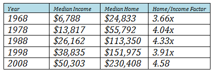
Table 1
Unadjusted income and home prices, 1968-2008 5/6/7
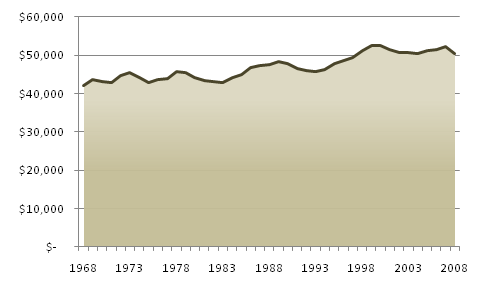
I think that’s just neat to look at. It doesn’t tell us a ton though. A more insightful and related chart would be one that shows income adjusted for time.
Figure 3
Adjusted median household income, 1968-2008 6/7
This is much more useful than the table above and it also reinforces figure 2.
In fact, median household income from 2000 to 2008 never peaked higher than 1999’s figure and 1998 beat out 2008! Ouch, that’s a decade lost.
So, now that I’ve got part of my apparent desire to be an economist out of the way for a few minutes (it’ll resurface before you know it), let’s recap and slowly work our way back to the whole home thing.
We know from comparing income to home values that we’re not quite as well off now as we were back in 1968 and we’ve stopped growing our median income nationally for roughly the last decade.
I suspected there was more to the story when I thought about health insurance. We all know its cost is up, but I personally didn’t know by exactly how much.
Figure 4
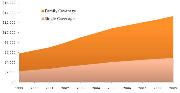
Private, employer-sponsored average annual premiums, 1999-2009 9
So clearly these costs are growing “like whoa” 4. In fact, from 1998 to 2008, those with family coverage through a private, employer-sponsored health insurance saw premiums rise by almost 127% (or at an average year-over-year growth of about 8.2%).
Private, employer-backed insurance breaks down into two components we should look at, however. When your company is providing insurance for your family, they pay the bulk of the cost and you pay the difference through co-pays and other out-of-pocket expenses. So, on a month-to-month basis, just how much is insurance taking out of our collective pockets?
Figure 5
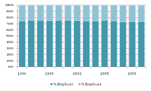
Private, employer-sponsored average (family coverage) cost distribution
between employers and employees 1996-2009 Average of 10/11 and 12/13
As it turns out, while the total cost has shot up like my money tree in my dreams, the allocation of who pays hasn’t changed much at all. I didn’t expect that. The variance for family coverage is 2.85% and for single coverage is 2.40%. This means we’re paying about 1.5% more now than we were in 1998. Not huge, but it doesn’t help when combined with the quickly rising total cost.
As many of us know, the employee portion of these rising costs hurts us directly. We see these costs as they come out of our accounts one at a time. But it also hurts our employers. They’re shouldering the larger portion of this quickly rising cost.
Well that’s poor news, but it explains things. I think it also brings up another good point, too. For the past decade there’s been a missed opportunity cost we’ve all forgone for the sake of insurance coverage. I’m talking about the income taken out of our pockets on our employers’ side.
I know as an entrepreneur (and someone who has written business planning software that takes into account exactly this kind of benefit expense for you – visit TheIdeaStartup.com for more info on that) that the total cost for resources comes most notably in terms of salary and total benefits.
The total cost of human resources has risen from the company’s perspective – but on the benefit side which means we’re not seeing the increase – it’s not padding our pockets.
I wanted to see what kind of a month to month impact all of this together might have on someone buying a home in 1998 versus buying a home in 2008.
Figure 6
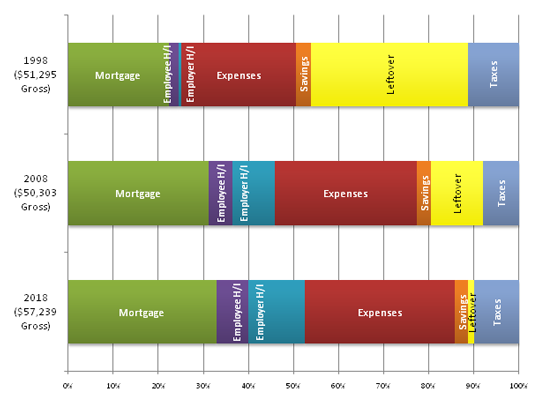
Monthly Expenses and Income in 1998, 2008, and 2018 (est.) Sources/Assumptions below
This little chart will take some explaining. Let me start by listing off the assumptions and sources of all the data here:
- I started with the median household income for 1998 and 20086
- I first broke out the monthly mortgage payments, assuming the full 28% debt-to-income ratio14 would be used. I’m also assuming a 30 year fixed mortgage at 5%, with 10% down and 1.5% property taxes plus PMI. The mortgages are for the respective years’ median home price.
- I’m assuming 30% of income goes to non-housing/medical CPI-category costs, adjusted using the CPI over time. This is the red portion of the graph, called “Expenses.” Basically I’m trying to capture the adjusted cost of things like food, clothes, transportation, recreation, education, communication, etc.
- Employee paid health insurance expenses are evenly allocated over 12 months using the 2009 average of 26.3% of total health insurance costs being paid by the employee. This works out to $1,382 and $3,354/year, respectively for 1998/2008 (Purple on graph, “Employee H/I”)
- Employer paid health insurance works out to $4,211 and $9,325/year, respectively for 1998/2008 (Teal on graph, “Employer H/I”)
- Personal savings, in orange, is 4% of gross income.
- Taxes, in dark blue, use their appropriate tax rate and assume the standard deduction for both 1998 and 2008.
- “Leftover,” in bright yellow, shows the monthly income allocation after the mortgage, expenses, health insurance, savings, and taxes.
- For my 2018 estimate I’m:
- Assuming +2.5% year-over-year growth for home values, as compared to the 1998-2008 average of +4.1% growth
- Compounding +1.3% year-over-year growth in income, despite the poor 1998-2008 average of -1.1%
- For health insurance, the 1998-2008 average was +8.2%, but I’m going with +5% year-over-year until 2018, hoping that growth in these costs will slow
- I use an average CPI growth for 2008-2018 of +2.5%. 1998-2008 actual was +2.7%
- I maintain the same 4% savings rate for 2018
- I estimate the 2018 tax rate will be 25% higher than the 2008 tax rate
All of this kind of tells us what we already know, but more concretely and visually (both of which I like!). A new mortgage has and probably will continue to eat up a larger portion of our income. Healthcare is killing us (both out of our families’ pockets and in terms of the lost raises from our employers due to their higher costs). Taxes have been the one component I’ve highlighted that’s actually shrunk since 1998. That helps the 1998-2008 comparison, but I don’t expect massive tax breaks and drops through 2018. I think the effective tax rate will only rise.
So, with that I think I’ve answered where the money our parents generation used to save for a home has gone. I’m pretty sure we’re still on the same road which makes me worried for future generations (specifically, my future kids, I’ll be honest).
I guess all I can do is hope that my family stays above “median.” I always thought the “American Dream” was the ability for you to pull yourself up by your bootstraps and make a life for yourself. Looks like that’ll only work if you’re well “above average” from now on. Isn’t that just a horrible thing to say…and even worse if I’m right?
I hope I’m wrong.
Matt
I should add that our addiction to credit card debt seems easily explainable when you look at the big picture. If there are more bills and the same amount of money, debt will pile up. See this infographic for more statistics on our national obsession with credit card debt (rest assured I’m not judging, I’m sadly a user myself).
I should also lazily confess that I haven’t even factored in college educations into the above. I didn’t factor in the hundreds or thousands many of us are already paying for our own student loans (looking forward to 2028 when those are done!). I also didn’t factor in the college saving funds we’d all be smart to start early for our own kids. Thinking about that on top of the rest of this makes my head spin.
Tags: Buying a Home, CPI, Debt, Healthcare, Income, Politics

Keep posting stuff like this i really like it
I just finished going through this process myself. Not only is it expensive, but buying a home can be a full time job in itself. Good luck, let me know if you have any questions!
We’re in the middle of it now, and it can be a full time effort, for sure!
Hey cous, Love this post! Just be glad you didn’t buy a house 4 years ago!
I read this post fully about the comparison of hottest and earlier technologies, it’s awesome article.